Here are some branding suites I've created for clients:
Milwaukee with Kids
Frustrated with how difficult it was to find fun, different things to do with her kids in Milwaukee, Calie Herbst founded Miltown Moms in 2013. After five years, it was time for a refresh to bring a bolder, more deliberate look to her growing brand. The logo represents the Milwaukee lakefront (sun, land, water) and the two Ms represent a mother & child. Colors, type, and icons were meant to be joyful, but not childish. The site's audience is savvy, exploring moms (not their kids). In 2019, she rebranded to Milwaukee with Kids to ensure more inclusivity for all parents and caretakers.
Hannah’s Kitchen
Hannah’s Kitchen, Milwaukee’s premier Kosher and Jewish catering company, was looking for a refresh to give the brand a more consistent feel and point of view. Primarily serving an older generation, Hannah’s Kitchen was looking for a branding suite with a homestyle feel that would honor traditions but still attract millennials with families. Drawing from mid-century modern motifs and natural, food-based colors, the updated look brings polish to Hannah’s and its retail sub-brands, HK Cafe and Hannah’s Cabana.
Accelerate
Accelerate Integrated Marketing Communications is a marketing consultancy rooted in the multi-disciplinary practice of integrated marketing. They wanted a brand that would communicate a smart, focused, experienced, and driven tone – they know what they’re doing, and will give clients creative, effective solutions across multiple media to drive growth for their brands.
CarePool
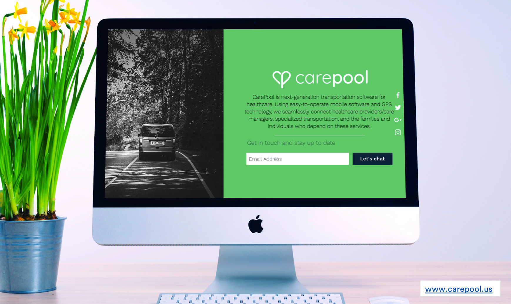
This startup, taking on the persistent problem of transportation for the elderly and disabled, wanted to be seen as both a tech company (like the growing number of rideshare apps) and a healthcare company. This simple re-design of their logo and bolder, simpler colors gave them a strong look for approaching investors.


11 Million Acres
Combining energy innovation and real estate development, 11 Million Acres is a growing startup in Chicago and beyond. While their business is inherently "green" in its energy production, they really wanted to stand out from all the typical green energy companies in the world, as we opted for electric brights against dark navy backgrounds. The result was a tech-forward feeling in a world where competitors all feel too similar.


And here are some branding suites I’ve built as part of agency teams:


